
Creating Custom Elements for Aurelia using TypeScript
Welcome to this fourth episode in the blog series about writing an Aurelia SPA, using TypeScript, with a Web API hosted on ASP.NET Core.
This post will focus on introducing Custom Elements into our Aurelia SPA. We will also discuss the positive aspects of using custom elements in web apps.
The “Aurelia SPA built with TypeScript and Sass on .NET Core” Series
These are the parts of this blog post series about building a SPA in Aurelia.
Part I – How to: Build an Aurelia SPA with TypeScript on ASP.NET Core
Part II – How to: Build a Web API on ASP.NET Core for an Aurelia SPA
Part III – How to: Fetching data from a Web API on ASP.NET Core to an Aurelia SPA
Part IV – How to: Creating Aurelia Custom Elements with TypeScript
Aim of this Post
In this post we will improve the view we wrote last time, with the help of custom elements. We’ll look at the reasoning behind using custom elements, and a bit of “history”. Then we’ll take a look at what’s required to create a basic custom element in Aurelia Then we implement our first custom element.
There won’t be as much installation and project fixing this time around, as in the previous posts. And the only new tool we’ll introduce will be the element generator of the Aurelia CLI.
Custom Elements, Recent History and Intent

For those new to this it might be good with a short introduction to custom elements.
Custom Elements is a way for us to break up our web applications into smaller building blocks.
In theory, your custom elements can be very large (as in contain much implementation logic and view markup), but that’s not the intent of them. The intent is to use the custom elements as small building blocks, to assemble and interconnect, to use them as the building blocks for the majority of your SPA’s.
As per usual when we talk modularization of code, it comes with the added benefits of testability, maintainability, better separation of concerns. Also the collaboration aspect improves as there will be fewer merge conflicts when a team is developing larger systems.
My first contact with components was when I started using Polymer back in june of 2015. For those of you who haven’t seen it, Polymer is a JavaScript framework by Google. It started out as an experiment, more or less, to see what the web development experience could be like when taking componentization as far as possible.
At the same time the initial work on the Web Component spec was on it’s way, and Google started to implement suggestions from the Web Component spec in Chrome. This was when the other vendor browsers were just discussing the Web Component specs.
Quite brave of the Chrome team, as it later would turn out that the W3C proposals would shift quite a bit for Web Components. Even to this day, the specs have not gone from Draft to Completed (3 out of 4 still in Draft). But it was fun to play around with, to imagine what the web would look like in 10 years, and see how the development experience could be.
If you want to read up on it, Web Components actually consists of 4 different specs, namely:
- HTML Templates – Status: Draft accepted and incorporated into HTML5
- Shadow DOM – Status: Draft
- HTML Imports – Status: Draft
- Custom Elements – Status: Draft
Custom Elements
So what is a Custom Element then? Well, according to the W3C draft:
Custom elements provide a way for authors to build their own fully-featured DOM elements
So what we can do is define our own DOM elements, our very own HTML tags!
For example, imagine you want to implement a date picker with a fancy calendar UI.
It would contain:
- markup for a flashy UI (HTML)
- a lot of styling (CSS / SCSS etc)
- loads of JavaScript / TypeScript code to take care of all the tricky date handling, events and other logic
As a custom element we could name it epic-calendar, and then we could use it in our web apps like this:
<epic-calendar></epic-calendar>
Surely it’d be more complex and have a few properties that could be set on it when declaring it. Let’s say start-date and region (for formatting date), with those parameter supported we’d use it like this in our app code:
<epic-calendar start-date="1974-09-13" region="sv-SE"></epic-calendar>
In my book, this is pretty awesome! Compared to the huge ASP pages I was writing in the early 2000’s, this is so terse and readable, and so much more fun to work with. 🙂
Custom Elements in Aurelia
We can make our own Custom Elements in Aurelia very easily. When using Aurelia CLI, like we are in this project, we can even use a generator for creating elements.
The Custom Elements consists of:
- A view – this is the .html file
- An optional view-model – the .ts/.js file
I personally also prefer to create a separate styling file for most of my elements, it’s no must, but a good way to keep track of styling in larger projects.
An Example Custom Element
If we look at the code we wrote in the previous post, we could make a droid tile element. Then we could use that in our repeater, and thus encapsulate all droid related code in our new custom element.
In the Aurelia CLI there’s a few helper methods that, called generators, that help with scaffolding out code. One of those generators are the Custom Element generator.
Open a CLI, position in the root of the web project and type:
au generate element
You will then be asked what to name the element, type in droid-tile.
This will create two files for us, droid-tile.html and droid-tile.ts, located in the src/resources/elements directory.

Implement the Custom Elements View
The only hard rule about custom element views in Aurelia is that they must be contained in the template tag. If we open the droid-tile.html file that got scaffolded for us, we see that it has the important template tag and a h1 tag.
Let’s move our droid presentation markup in to this element:
<template>
  <div>
    <span>ID: ${droid.id}</span> <span>Name: ${droid.name}</span>
  </div>
  <div>
    <span>Model: ${droid.productSeries}</span> <span>Height: ${droid.height}</span>
  </div>
</template>
In the markup we got bindings to a droid member, this is defined in the view-model, our backing TypeScript file.
Implement the Element View Model
Edit the generated TypeScript file, droid-tile.ts, like this:
import {bindable} from 'aurelia-framework';

export class DroidTile {
  @bindable droid;
}
This is a very simple code behind, the only thing happening here is that we are declaring the droid member as a bindable property. This means we can use it to bind data into the element, when we use the element in markup.
Using the Custom Element
The plan is to use this element in the repeater, the one we implemented in the previous post in this series.
First we need to get the element in scope of the view where we are about to use it, we do this using the require element.
After requiring the custom element we can use it in our markup. And make sure to bind the repeaters droid item into the elements droid member, using the .bind expression.
Edit app.html like this:
<template>
	<require from="./resources/elements/droid-tile"></require>
	<h1>${header}</h1>

	<div repeat.for="droid of droids">
		<droid-tile droid.bind="droid"></droid-tile>
	</div>
</template>
If you remember what we said about repeaters in the previous post, we can also use them on custom elements. So we can make our code even more terse, by setting the repeater straight on the droid-tile element, like this:
<template>
	<require from="./resources/elements/droid-tile.html"></require>
	<h1>${header}</h1>

	<droid-tile repeat.for="droid of droids" droid.bind="droid"></droid-tile>
</template>
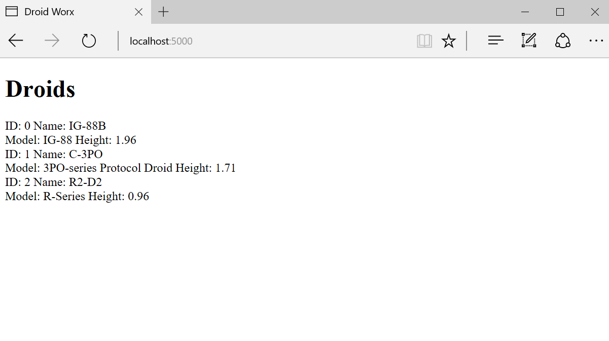
Below is the result, our first Aurelia custom element in action.
Custom Elements without View Model
Since the view model for our custom element is so simple, would it not be great if we didn’t even need it? Luckily, Aurelia supports view only custom elements out of the box.
To make our droid-tile element view-only we just need to change it a little bit, to enable the data binding.
On the template tag we need to declare an attribute named bindable and give it the properties we are binding too, like this:
<template bindable="droid">
  <div>
    <span>ID: ${droid.id}</span> <span>Name: ${droid.name}</span>
  </div>
  <div>
    <span>Model: ${droid.productSeries}</span> <span>Height: ${droid.height}</span>
  </div>
</template>
When using view-only custom elements we also need to refer to them slightly different when we require them. We need to add the .html file ending when referring to the element, this way Aurelia knows it shouldn’t look for a view model.
To use this element from app.html, just change the require element like this:
<require from="./resources/elements/droid-tile.html"></require>
No more change is needed in the code using the element.
At first when starting out with Aurelia I felt all my elements should always have three files, the view, the view-model and a styling file. But as I continue to write more code I have backed away from this, feeling I should have as few files as possible. So if I can condense my custom elements into just having a view, I will opt for that.
As for other Aurelia developers I’m not sure, what do you think is the best way to structure Aurelia apps, please leave a comment below and let me know!
Next Part – Navigating our Aurelia SPA using the Router
Our SPA is in serious need of some more pages, so that we can manipulate our droid objects. But to be able to handle more pages we’ll have a look at Aurelia’s Router and implement routing for our SPA.
Get the Code
The code for this blog series is available on my GitHub repo, you can find it here: DWx-Aurelia-dotNETCore
Until next time,
Happy Coding! 🙂
Pingback: How to: Build a Web API on ASP.NET Core for an Aurelia SPA - mobilemancer
Pingback: How to: Fetch data from Web API on ASP.NET Core to an Aurelia SPA - mobilemancer