
Styling an Aurelia SPA with Sass
Welcome to the sixth episode about writing an Aurelia SPA. Now we take a look at styling the SPA using Sass.
The “Aurelia SPA built with TypeScript and Sass on .NET Core” Series
These are the parts of this blog post series about building a SPA in Aurelia.
Part I – How to: Build an Aurelia SPA with TypeScript on ASP.NET Core
Part II – How to: Build a Web API on ASP.NET Core for an Aurelia SPA
Part III – How to: Fetching data from a Web API on ASP.NET Core to an Aurelia SPA
Part IV – How to: Creating Aurelia Custom Elements with TypeScript
Part V – How To: Configure and Use the Router in an Aurelia SPA
Part VI – How To: Style an Aurelia SPA with Sass
Aim of this Post
We’ll take a look at styling our SPA. We’ll reason a bit about how to think when starting to style a Web App, and look at how to structure files in the project.
Styling an Aurelia SPA with Sass
Time to start styling our application. In this post we’re going to look at how to get started styling our Aurelia SPA with the help of Sass.
Why not Bootstrap, Zurb Foundation (* insert arbitrary CSS framework)?
Well, in part I’m going to base the start of the styling on a few helper “frameworks”. But the reason for not selecting something like Bootstrap is that I don’t like it when so much is given from the beginning. There is no way your site won’t be looking very much like the originating framework, if you go down this road.
And most of all, using a pre-baked CSS framework won’t let you practice your styling skills, and you won’t end up a better programmer after using it!
I do however feel that CSS frameworks have their place. They are excellent when you need to spike something quick, and don’t have any time for styling. Showing a weekend hack to colleagues or your boss? Slapping some pre-baked CSS on it will make it way more compelling than just using no styles at all.
But weather you are writing an Aurelia SPA as a hobby project, or working on a big production site, I hope you find this article a good starting point for taking control over your applications look and feel 🙂
Using a pre-made Base
As I stated above, I’m depending on some helper frameworks. These being:
- Bourbon – A helper library for Sass, consisting of very handy mixins
- Bourbon Neat – Companion to Bourbon giving us a handy grid system
- Bourbon Bitters – Style scaffold for Bourbon, styles that will make starting up quicker
Installing the Bourbon Styles
The Bourbon packages
- Run the following from the root of the project:
npm install --save-dev bourbon
npm install --save-dev bourbon-neat
npm install --save-dev bourbon-bitters
- Add new folder src/styling
- Get the file called copystyles.bat from the GitHub repo, it’s in the root of the web project
- Use the bat-file to copy the Bourbon styles into the project structure, just position in the root of the web project and run the file
- The files will be copied into src/styling/externals. If you prefer you can manually move the files, just look at he bat-file for the folder structures to move
Proper Setup of Sass Styling
Our own styles will be arranged under the folders src/stylings/globals, src/stylings/views and src/stylings/components:
- The globals folder contain global styling items, like for ex a reset, variables and colors
- In the views folder, styles for specifc views will be kept
- All our custom elements will have their own styling in the components folder
- And the folder we created when coping Bourbon above, the externals folder will house all third party stylings
This is my prefered folder structure at the moment when working with Aurelia SPA’s. But there are other views on this, one popular setup is called 7-1, but it’s up to you here to find something that works for you and keeps you effective 🙂
Sass Style Setup Options
Before we start, we need to discuss two different ways of thinking when using Styles from our Aurelia SPA.
There are two primary ways to use styles.
One being collecting all styling in one (or very few) main css files. Then import/reference this early in the process.
Another is to break up your styling in very small individual files, reference base styling into these smaller ones, then import/refer to these in every view or component that needs them.
Aurelia is nice in the way it will support whatever way of working you choose here. Making it really easy to import styling using the require element that we’ve used before in this series. Importing css files with the require element looks like this:
<require from="./styling/main.css"></require>
In this project I’m going to go for option one here. Have just one main.css file, that we import all our smaller scss files into. Then import the main styling file early in process.
Sass Technicalities
If you are new to Sass, this is good to know:
- Prefixing a file with underscore “_”, means it’s a partial file. This implies there will be no css file transpiled from it
- When refering to scss files and importing them, there is no need to prefix with an underscore or end with “.scss”
Start Styling with Sass
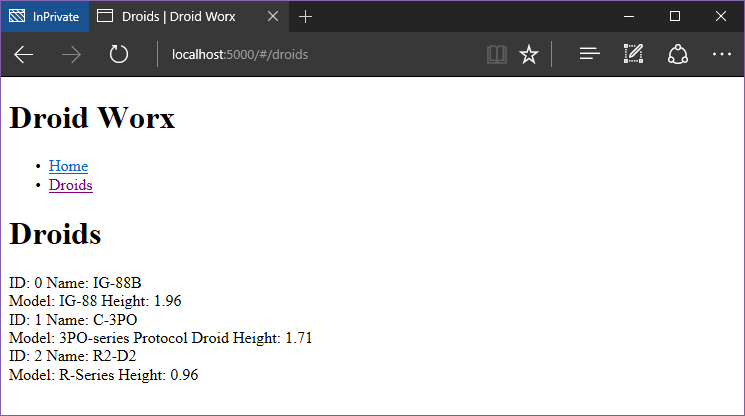
So before we start, this is what the droid listing page looks like:
First of all, let’s put our Bourbon base styles into use.
Using the Bourbon Styles
First add new file, src/styling/main.scss.
Import bourbon, neat and bitters in the file like this:
@import "./external/bourbon/bourbon";
@import "./external/bourbon-bitters/bitters";
@import "./external/bourbon-neat/neat";
The main.scss file is our base for everything, we will keep it clean from styles but use it to import every other styling file we produce.
Now we use the transpiled result from our file, namely main.css in our application. We import it using the require element in app.html like this:
<require from="./styling/main.css"></require>
Note! we refer to the styling file with the ending .css, not .scss, as it’s being transpiled by our build system to a css file.
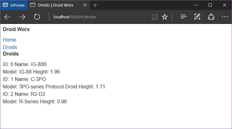
Compile and reload the app. It will now show the bitters base styling in effect, removing the bullets from our un-ordered list and using a different font.
Styling a Custom Component in Aurelia
So how do you style custom components in Aurelia? I prefer to keep one styling file per component, and put them all in the components folder.
Let’s style our page-header component first.
Styling the Page-Header Custom Component
- Create a new file, src/stylings/components/_page-header.scss
- Add another file in the same folder, name it _all.scss
- Add an import of the _page-header file in the _all.scss file, like this:
@import "page-header";
- Then add an import of the _all file from src/styling/main, like this:
@import "components/all";
What we did now, except create an empty style file for a component, is create one main file in the components directory, then import that in the main.scss file.
This is a nice technique to use as to un-clutter the main.scss file. We’ll use this for all our folders containing styles from now on.
Now let’s add some styling to our page-header component, add this to _page-hader.scss:
page-header {
  .header {
    background-color: #403075;
  }

  h1 {
    font-size: 24px;
    color: #887caf;
    padding: 16px;
    margin: 0;
  }

  ul {
    list-style-type: none;
    margin: 0;
    padding: 0;
    overflow: hidden;
    background-color: #582a72;
  }

  li {
    float: right;
  }

  li a {
    display: block;
    color: #9775aa;
    text-align: center;
    padding: 8px 8px;
    text-decoration: none;
  }

  li a:hover {
    background-color: #764b8e;
    color: #9775aa;
  }

  li a:visited,
  li a:focus {
    color: #9775aa;
  }
}
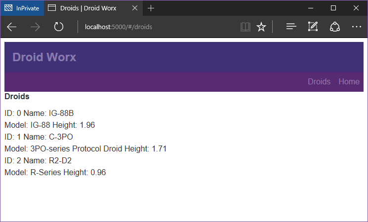
This will result in the following:
Styling Cleanup Using Sass Variables
As we can see, there is some repetition going on in the file regarding the color values. The color values are also fairly close to eachother and would probably be hard to keep track of in the future.
Sass variables to the rescue!
One of the great benefits to using Sass is the possibility to use Variables. Let’s try it out, and move our color values into another file:
- Create a new folder in the globals folder, name it _colors.scss
- Import the new file into the _main.scss file
I used Paletton.com create my base color table. Then I export that and paste into my color document.
But I use my own variables to refer to the generated colors, just in case I decide to later switch it up and also keep readability a bit better.
Edit _colors.scss like this:
// color palette
// primary
$color-primary-neutral: #403075;
$color-primary-lightest: #887caf;
// secondary
$color-secondary-neutral: #582a72;
$color-secondary-lighter: #764b8e;
$color-secondary-lightest: #9775aa;
Using these variables in _page-header.css looks like this
page-header {
  .header {
    background-color: $color-primary-neutral;
  }

  h1 {
    font-size: 24px;
    color: $color-primary-lightest;
    padding: 16px;
    margin: 0;
  }

  ul {
    list-style-type: none;
    margin: 0;
    padding: 0;
    overflow: hidden;
    background-color: $color-secondary-neutral;
  }

  li {
    float: right;
  }

  li a {
    display: block;
    color: $color-secondary-lightest;
    text-align: center;
    padding: 8px 8px;
    text-decoration: none;
  }

  li a:hover {
    background-color: $color-secondary-lighter;
    color: $color-secondary-lightest;
  }

  li a:visited,
  li a:focus {
    color: $color-secondary-lightest;
  }
}
Styling the Droid-Tile Custom Component
Let’s style the droid-tile component while we are at it.
- Add a _droid-tile.scss file to the components folder
- Import the _droid-tile file in _all.scss for components, just like above
Before styling the droid-tile component, we need to add some more tags and classes to the element:
<template bindable="droid">
  <div class="tile">
    <div class="row">
      <div class="first">
        <span class="label">ID:</span>
        <span class="value"> ${droid.id}</span>
      </div>
      <div class="second">
        <span class="label">Name:</span>
        <span class="value"> ${droid.name}</span>
      </div>
    </div>
    <div>
      <div class="row">
        <div class="first">
          <span class="label">Model:</span>
          <span class="value">${droid.productSeries}</span>
        </div>
        <div class="second">
          <span class="label">Height:</span>
          <span class="value">${droid.height}</span>
        </div>
      </div>
    </div>
  </div>
</template>
Now, add the following to _droid-tile.scss:
droid-tile {
  @include outer-container;

  .tile {
    @include span-columns(12);
    margin: 16px 0 16px 0;
    padding: 16px;
    background-color: $color-tertiary-neutral;
    color: $color-tertiary-lighter;

    .row {
      @include row();

      .first {
        @include span-columns(5);
      }

      .second {
        @include span-columns(7);
      }
    }
  }
}
As you can see in the styling file, I’m using a bit of Bourbon Neat magic here to space out elements according to a grid.
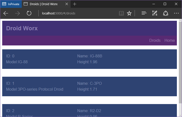
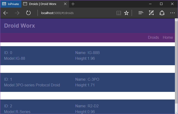
The result after styling the droid-tile component (I also removed the header element from the views/droids/list.html):
Fixing Browser Quirks
Browsers have their own out of the box styling for some elements. This leads to inconsistent appearance of your web apps on different browsers.
This is usually remedied by using some kind of “reset”. A reset is a css file that just makes the different browsers behave in a more predictable way, and make your app look more similar in all of the,
In the screenshots above we can see one such browser specific behavior. If you look closely there’s a margin around our SPA, that we never specified in any styling file.
We can import and use Normalize to remove this behavior:
- From the root of the web project, run:
npm install --save-dev normalize.css
- Make a new folder, src/stylings/external/normalize
- Copy npm_modules/normalize.css/normalize.css to src/stylings/external/normalize
- Rename src/stylings/external/normalize/normalize.css to _normalize.scss
- Import our renamed normalize in the top of our main.scss file
Now we get a more uniform experience of our app on different browsers, and we can see the browser styling being reset and our margin removed:
Conclusion
There’s more styling to be done for our SPA, for main views and the droid detail view. But I plan on revisiting The droid details view properly in another post when looking in to using Forms in Aurelia.
Then we will create forms to edit and create droids. And also style those pages as well.
Get the Code
The code for this blog series is available on my GitHub repo, you can find it here: DWx-Aurelia-dotNETCore
Hope this post enables you to get going quickly with styling your Aurelia SPA’s! If there’s anything that need more clarification, or if you just plain liked the post – Please leave a comment below!
Until next time,
Happy Coding! 🙂