
Responsive Master-Pages with Aurelia-UX
I had so much fun constructing AureliaWeekly.com using Aurelia-UX that I felt I should write one (or several) blogs about it. I had a hard time deciding what to start with, but lately I’ve seen so many web pages that are horrible on smaller form factors that I decided that I wanted to show how I constructed responsive pages with the help of Aurelia-UX.
Responsive Pages is the Goal
The goal of this article is to show how to create responsive Master pages (or layout’s) with the help of Aurelia-UX. The end result is shown in the animation below.
Creating Master-Pages
For those unfamiliar to the concept, a master page is a template that you put content in. This way you can keep your content pages free from a lot of layout markup. Now, doesn’t that sound good? 🙂
How to work with layouts/master pages is described in the Aurelia documentation.
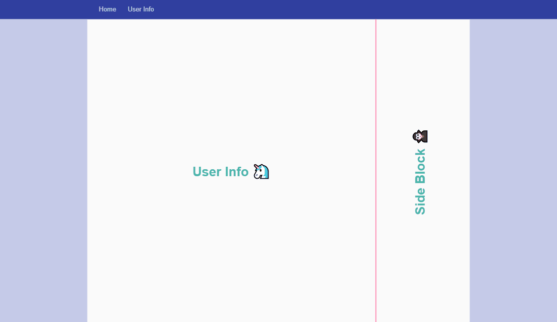
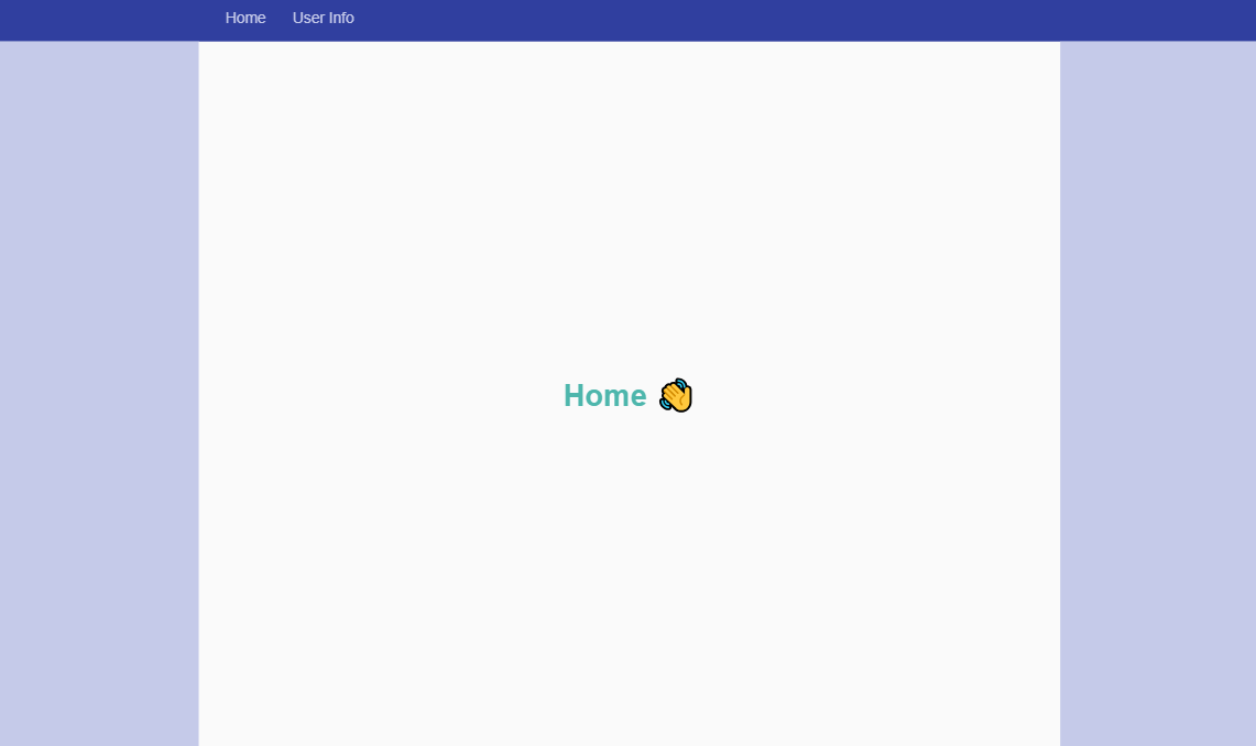
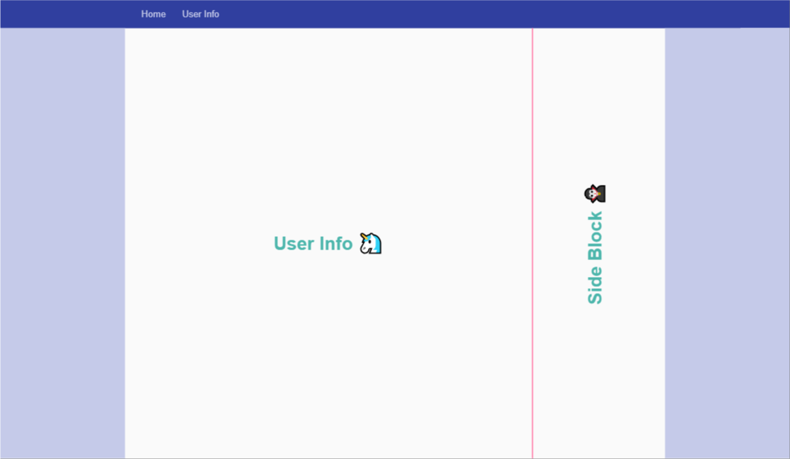
In the demo app there are two different layout pages.
The first layout has just one big main column with side columns that expands as the screen size expands.
The second layout is a two column layout, it also has side columns that expand as the screen size expands.
Responsive Sidebars
Handling responsive layouts with Aurelia-UX is easy. The base of the layout is a Grid. So for different screen widths, just define a new column-size for the sidebars containing white space. For smaller screen sizes I opt to hide the columns completely. Using the properties of the UxResponsiveUtilities class of the Grid component, we can show the sidebar only when the width passes the break point for medium screens and up.
A side bar, with breakpoints, is defined as follows:
<div class="side-bar ux-grid-cell ux-grid-cell--md-1 ux-grid-cell--lg-2 ux-grid-cell--xl-3" if.bind="uxResponsive.md || uxResponsive.lg || uxResponsive.xl">
</div>
Note that the if.bind statement will hide the sidebar when the page width is below 960px. Also, to access UxResponsiveUtilities it needs to be defined in the view model of the page. As I’m using TypeScript, the view model looks as follows for the two column layout:
import { autoinject } from "aurelia-framework";
import { UxResponsiveUtilities } from '@aurelia-ux/grid';

@autoinject
export class TwoColumn {
  constructor(public uxResponsive: UxResponsiveUtilities) { }
}
Working with the UX-Grid Component v0.13.0 And Beyond
The ux-grid component has been reworked a little in v.0.13.0, making
The Full Setup
Let’s start with the looking at how the Router is configured:
import { PLATFORM } from 'aurelia-framework';
import { RouterConfiguration } from 'aurelia-router';

export class App {
  configureRouter(config: RouterConfiguration): void {
    config.map([
      // Home
      {
        route: ["", "home"],
        name: "home",
        moduleId: PLATFORM.moduleName("modules/home/home"),
        layoutViewModel: PLATFORM.moduleName("resources/layouts/one-column"),
        nav: true,
        title: "Home",
        settings: { auth: false }
      },
      // User info
      {
        route: "user-info",
        name: "user-info",
        moduleId: PLATFORM.moduleName("modules/user/info"),
        layoutViewModel: PLATFORM.moduleName("resources/layouts/two-column"),
        nav: true,
        title: "User Info",
        settings: { auth: false }
      }
    ]);
  }
}
The only thing to notice here is that we are using layoutViewModel as we need the view model of the layout pages for the UxResponsiveUtilities binding to work.
The master-page layout for the two column view is defined like this:
<template>

<div class="au-animate" anim-enter="transition.bounceLeftIn" anim-leave="transition.bounceRightOut">

  <div class="ux-grid ux-grid--remove-padding">

      <!-- padding -->
      <div class="side-bar ux-grid-cell ux-grid-cell--md-1
                  ux-grid-cell--lg-2 ux-grid-cell--xl-3"
           if.bind="uxResponsive.md || uxResponsive.lg || uxResponsive.xl">
      </div>
      <!-- padding -->

      <!-- main window -->
      <div class="ux-grid-cell ux-grid-cell--sm-8 ux-grid-cell--md-7
                  ux-grid-cell--lg-6 ux-grid-cell--xl-4">

        <!-- main content -->
        <slot name="mainblock">
          Fallback content of slot named "mainblock"
        </slot>
        <!-- main content -->

      </div>
      <!-- main window -->

      <!-- side-bar -->
      <div class="side-bar-content ux-grid-cell ux-grid-cell--sm-4
                  ux-grid-cell--md-3 ux-grid-cell--lg-2 ux-grid-cell--xl-2"
           show.bind="uxResponsive.sm || uxResponsive.md
                      || uxResponsive.lg || uxResponsive.xl">

        <!-- sidebar content -->
        <slot name="sideblock">
          Fallback content of slot named "sideblock"
        </slot>
        <!-- sidebar content -->

      </div>
      <!-- side-bar -->

      <!-- padding -->
      <div class="side-bar ux-grid-cell ux-grid-cell--md-1
                  ux-grid-cell--lg-2 ux-grid-cell--xl-3"
           if.bind="uxResponsive.md || uxResponsive.lg || uxResponsive.xl">
      </div>
      <!-- padding -->

    </div>

  </div>

</template>
Worth noting here is that the sidebar with content is also being hidden when the screen size drops enough. Unlike the empty sidebars, the sidebar conditional display is managed with show.bind as slot’s don’t render dynamically in component view.
As we saw before ☝, the backing view model of the layout’s is very simple and just contains an exposure of the UxResponsiveUtilities as a property.
The module user-info that we render inside the two-column view looks like this:
<template>
<div slot="mainblock">
<div class="info-container">
<div class="info-text">
User Info 🦄
</div>
</div>
</div>
<div slot="sideblock">
<div class="info-container">
<div class="info-text text-vert">
Side Block 🧛
</div>
</div>
</div>
</template>
Wrap Up
I hope you enjoy playing around with Aurelia-UX as much as I do! 😁 As it’s still early in development, please remember to give feedback and if you feel up to it please contribute with a pull request.
Get the code
The code is published in my GitHub repository under aurelia-ux-responsive-masterpages.
Happy Coding! 🙂
Pingback: Dew Drop - December 6, 2018 (#2854) - Morning Dew
Guys I don’t get it. Why are we wasting time creating another responsive framework when there are many other well tested ones out there?
Maybe tweak the layout of a nice Bootstrap4 CSS framework, but please don’t create another one in which you are actually going against the best aspects of Aurelia. It’s standards-compliant and framework agnostic. So the CSS/responsiveness should largely be taken care of in the CSS. There should be no needs for show.bind to decide when to place elements. THAT IS CSS MEDIA related.
You can certainly use CSS for this if you like, I just choose not too.
I just used show.bind cause that’s what I wanted to play around with at the time. It’s just a helper available in Aurelia-UX, and you don’t have to use it if you don’t want.
I would agree with you if Aurelia-UX was aiming to be a CSS framework. But it is in fact a javascript-driven UX framework which makes this an apples-to-oranges comparison.
There are certainly many good reasons not to use Aurelia-UX such as the ones you mentioned. There are many well-tested CSS frameworks out there which – in most cases – solve the same problem in a more “portable” manner.
With Aurelia-UX this is turned the other way around: it’s CSS-framework agnostic. You can programmatically manipulate the look and feel of a UI (at runtime) via a set of well-defined APIs.
Doing this with a CSS framework like bootstrap, you’ll quickly end up with a paid library like KendoUI or GSAP and hope there is a maintained integration library for the SPA framework you use it with.
Aurelia-UX fills this gap and is deeply integrated with Aurelia. No integration or boilerplate needed. It works perfectly for those who are committed to Aurelia (which goes for most people who ever start using it)